Today, We want to share with you Inverted Rounded Corner Border Radius in CSS.In this post we will show you Create Inverted Corner Border Radius in CSS, hear for Beveled corners & negative border-radius with CSS3 gradients we will give you demo and example for implement.In this post, we will learn about Border radius inset or inverted rounded corners with an example.
Inverted Rounded Corner Border Radius in CSS
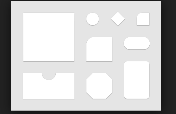
There are the Following The simple About Inverted Rounded Corner Border Radius in CSS Full Information With Example and source code.
As I will cover this Post with live Working example to develop Inverted rounded corners in CSS, so the css inverted border radius for this example is following below.
Step 1: HTML Source Code:
This file contains the following HTML Markup Source codes.
Option 1Option 2 - pseudo class :before and :afterHello! I am angular Web-devloper and pakainfo is my web technologies blog. My specialities are Vuejs,API,angularjs,Vuejs,PHP, API, jQuery,Earn money,HTML,CSS eCommerce,JS,Laravel, CMS and bespoke web application development.pakainfo.com is the most popular Programming & Web Development blog. Our mission is to provide the best online resources on programming and web development. We deliver the useful and best tutorials for web professionals — developers, programmers, freelancers and site owners. Any visitors of this site are free to browse our tutorials, live demos and download scripts.
Step 2: CSS Source Code
Following CSS Source codes are used for Invert rounded corner in CSS.
body {margin:20px}
.corners {
  background: #eee;
  color: #333;
  position:relative;
  margin:20px;
  overflow:hidden;
}
.text{
  border: 1px solid #ccc;
  padding:8px 20px 8px;
}

/*Option 1 */
.arc-bottom-l, .arc-bottom-r, .arc-top-l, .arc-top-r {
  position:absolute;
  background:#fff;
  width:24px;
  height:24px;
  border-radius:50%;
  border: 1px solid #ccc;
}
.arc-bottom-l {
  bottom:-12px;
  left:-12px;
}
.arc-bottom-r {
  bottom:-12px;
  right:-12px;
}
.arc-top-l {
  top:-12px;
  left:-12px;
}
.arc-top-r {
  top:-12px;
  right:-12px;
}

/* Option 2 */
.arc-top, .arc-bottom {
  position: absolute;
  width: 100%;
  height: 100%;
  top: 0;left: 0;
}
.arc-top:before, .arc-top:after, .arc-bottom:before, .arc-bottom:after {
  content:'';
  position: absolute;
  width: 24px;
  height: 24px;
  background-color: #fff;
  border: 1px solid #ccc;
  border-radius: 50%;
}
.arc-top:before {
  top: -12px;
  left: -12px;
}
.arc-top:after {
 top: -12px;
 right: -12px;
}
.arc-bottom:before {
  bottom: -12px;
  left: -12px;
}
.arc-bottom:after {
 bottom: -12px;
 right: -12px;
}
Angular 6 CRUD Operations Application Tutorials
Read :
Summary
You can also read about AngularJS, ASP.NET, VueJs, PHP.
I hope you get an idea about Inverted Rounded Corner Border Radius in CSS.
I would like to have feedback on my Pakainfo.com blog.
Your valuable feedback, question, or comments about this article are always welcome.
If you enjoyed and liked this post, don’t forget to share.