I am giving you carousel vertical slider demo with boostrap. this is thumbnail image vertical slider. in this slider I am also display next previous button. you can use this bootstrap multiple image slider autoplay in sidebar. and also use in main HTML Website footer. this vertical slider support all the browser Like chrome, Mozila , etc. bootstrap multiple image slider is fully responsive slider design.
Bootstrap vertical carousel slider with jQuery
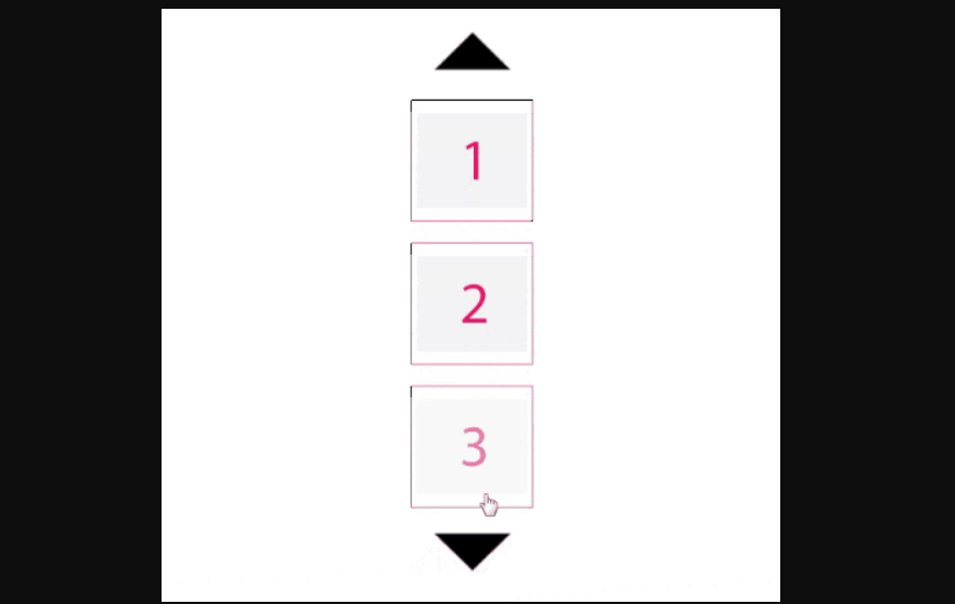
We allows to free Articles of bootstrap vertical thumbnail carousel, you can 100% free download full source code of bootstrap vertical carousel multiple items layout. Here in this post i will give you example of vertical carousel bootstrap 4 article and you will copy paste simple source code of html, css and jquery. In vertical text slider bootstrap article i give you three tab with html, css and js, you can easily retrive all the source code of bootstrap multiple image slider layout.
bootstrap vertical carousel slider with jQuery
HTML Source code


JavaScript Code
$('.carousel .vertical .item').each(function(){
  var next = $(this).next();
  if (!next.length) {
    next = $(this).siblings(':first');
  }
  next.children(':first-child').clone().appendTo($(this));

  for (var i=1;i<2;i++) {
    next=next.next();
    if (!next.length) {
    	next = $(this).siblings(':first');
  	}

    next.children(':first-child').clone().appendTo($(this));
  }
});
CSS Code
body{
    background-color: #4A7296;
}
.carousel-inner.vertical > .item {
    -webkit-transition: .10s ease-in-out bottom;
    -moz-transition: .10s ease-in-out bottom;
    -o-transition: .10s ease-in-out bottom;
    transition: .10s ease-in-out bottom;
}
@media all and (transform-3d),
(-webkit-transform-3d) {
.carousel-inner.vertical > .item {
    -webkit-transition:-webkit-transform .6s ease-in-out;
    -moz-transition:-webkit-transform .6s ease-in-out;
    -o-transition:-o-transform .6s ease-in-out;
    transition:transform .6s ease-in-out;
    -webkit-backface-visibility:hidden;
    -moz-backface-visibility:hidden;
    backface-visibility:hidden;
    -webkit-perspective:1000;
    -moz-perspective:1000;
}
.carousel-inner.vertical > .item.next,
.carousel-inner.vertical > .item.active.right {
    -webkit-transform: translate3d(0, 33.33%, 0);
    -moz-transform: translate3d(0, 33.33%, 0);
    transform: translate3d(0, 33.33%, 0);
    top:0px;
}
.carousel-inner.vertical > .item.prev,
.carousel-inner.vertical > .item.active.left {
    -webkit-transform: translate3d(0, -33.33%, 0);
    -moz-transform: translate3d(0, -33.33%, 0);
    transform: translate3d(0, -33.33%, 0);
    top: 0px;
}
.carousel-inner.vertical > .item.next.left,
.carousel-inner.vertical > .item.prev.right,
.carousel-inner.vertical > .item.active {
    -webkit-transform: translate3d(0, 0, 0);
    -moz-transform: translate3d(0, 0, 0);
    transform: translate3d(0, 0, 0);
    top:0px;
  }
}
.carousel-inner.vertical > .next,
.carousel-inner.vertical > .prev {
    height: 100%;
    width: auto;
}
#carousel-pager .carousel-control.left,#carousel-pager .carousel-control.right{
    width:50px;
    height:50px;
    border-radius: 50%;
    background:#FFF;
    opacity: 1;
    position: absolute;
    top:-65px;
    left:50%;
    transform: translateX(-50%);
}
#carousel-pager .carousel-control.right {
    top:unset;
    bottom: -65px;
    left:50%;
    transform: translateX(-50%);
}
.left .glyphicon,.right .glyphicon{
    position:absolute;
    top:13px;
    left:16px;
    color:#004C70;
}
.right .glyphicon{
    top:16px;
    left:15px;
}
.item img{
    border:1px solid #e2e2e2;
    padding: 5px;
    border-radius:5px;
    margin:5px;
}
.carousel{
    margin-top:80px;
}
Web Programming Tutorials Example with Demo
Read :
Summary
You can also read about AngularJS, ASP.NET, VueJs, PHP.
I hope you get an idea about Bootstrap 4 Carousel With Title And Description News Slider.
I would like to have feedback on my infinityknow.com blog.
Your valuable feedback, question, or comments about this article are always welcome.
If you enjoyed and liked this post, don’t forget to share.