css background image opacity : – here you can learn to CSS Opacity / Transparency, Transparent Hover Effect, Transparent Box, Transparency using RGBA, Text in Transparent Box and background image opacity css. also The default opacity 1.0 where image looks complete solid. as well as 0.1 nearly transparent with text gets visible more clearly.
css background image opacity
using css background image opacity
- transparent Text
- transparent Box
- Transparent Border
- transparent color Div
- Transparent Image
- Transparency
Background Opacity Syntax
opacity: 1.0 opacity: 0.6 opacity: 0.1 opacity: inherit filter: alpha(opacity=100); zoom: 1;
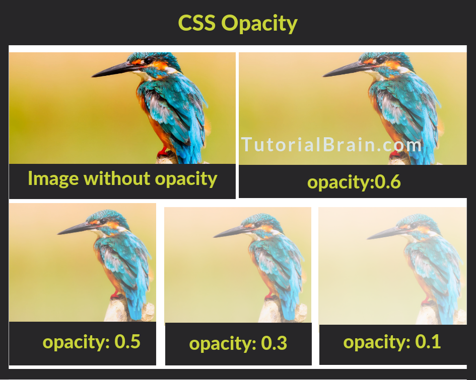
Example 1: opacity: 0.4;
<!DOCTYPE html> <html> <head> <style> img { opacity: 0.4; } </style> </head> <body> <h2>Image Transparency</h2> <p>background image opacity css</p> <p>Image with 40% opacity:</p> <img src="your_image_full_path.jpg" alt="web Devloper" width="200" height="300"> </body> </html>
Don’t Miss : gradient overlay css
Transparent Hover Effect
<!DOCTYPE html> <html> <head> <style> img { opacity: 0.6; } img:hover { opacity: 2.0; } </style> </head> <body> <h2>Image Transparency - background image opacity css</h2> <p>css background image opacity opacity on mouse-over:</p> <img src="php_logo.jpg" alt="PHP" width="200" height="320"> <img src="laravel_logo.jpg" alt="Laravel" width="200" height="320"> <img src="angularjs_logo.jpg" alt="Angularjs" width="200" height="320"> </body> </html>
Transparent Box Example
<!DOCTYPE html> <html> <head> <style> div { background-color: #3d3d3d; padding: 15px; } div.tutorial { opacity: 0.1; } div.article { opacity: 0.3; } div.blog { opacity: 0.6; } </style> </head> <body> <h2>Transparent Box - example</h2> <p>Transparent Box Example:</p> <div class="tutorial"><p>tutorial opacity 0.1</p></div> <div class="article"><p>article opacity 0.3</p></div> <div class="blog"><p>blog opacity 0.6</p></div> <div><p>Simple opacity 1 (default)</p></div> </body> </html>
Text in Transparent Box
<!DOCTYPE html> <html> <head> <style> div.background { background: url(wallpaper.jpg) repeat; border: 2px solid black; } div.cartbox { margin: 30px; background-color: #ffffff; border: 1px solid black; opacity: 0.6; } div.cartbox p { margin: 5%; font-weight: bold; color: #000000; } </style> </head> <body> <div class="background"> <div class="cartbox"> <p>Welcome To Happy Coding free Download Source code.</p> </div> </div> </body> </html>
How to Change a CSS Background Image’s Opacity
Using a Separate Image Element and Positioning
<div class="example-wrap"> <img class="example-bg" src="your_domain_name/path/images/blog_logo.png" alt="" > <div class="example-content"> <h2>Welcome To Pakainfo</h2> </div> </div> <style> .example-wrap { overflow: hidden; position: relative; } .example-bg { opacity: 0.6; position: absolute; left: 0; top: 0; width: 100%; height: auto; } .example-content { position: relative; } </style>
Using CSS Pseudo-Elements
<div class="example-wrap"> <div class="example-content"> <h2>Welcome To Happy Coding free Download Source code.</h2> </div> </div> <style> .example-wrap { position: relative; } .example-wrap:before { content: ' '; display: block; position: absolute; left: 0; top: 0; width: 100%; height: 100%; opacity: 0.6; background-image: url('your_domain_name/path/images/blog_logo.png'); background-repeat: no-repeat; background-position: 50% 0; background-size: cover; } .example-content { position: relative; } </style>
Set opacity of background image without affecting child elements
<div><span>Pakainfo.com.</span></div> div { width: 600px; height: 300px; background: linear-gradient(rgba(255,255,255,.5), rgba(255,255,255,.5)), url("full_image_path/image_name.jpg"); } span { background: black; color: white; }
CSS Image Opacity (Transparency)
<!DOCTYPE html> <html> <head> <style> img { opacity: 0.3; filter: alpha(opacity=30); /* For IE 8 & 9 (more valid) */ } </style> </head> <body> <img src="img/php_logo.png" width="245" height="145" alt="PHP Website Logo"> </body> </html>
How to create a transparent color Div
<!DOCTYPE html> <html > <head> <style type="text/css"> .demo{ width:250px; height:250px; background:green; border: 1px solid black; float:left; align:center; opacity:1.0; } .example{ width:250px; height:250px; background:green; border: 1px solid black; float:left; align:center; opacity:0.5; } </style> </head> <body> <div class="demo"> opacity 1.0 </div> <div class="example" > opacity 0.5 </div> </body> </html>
transparent Text
<!DOCTYPE html> <html> <head> <style> .demo { width:200px; height:190px; background: url(images/pakainfo_logo.png) no-repeat; border:5px solid #3d3d3d; font-size: 65px; color:rgba(255,255,255,.5); font-weight: 900; } .trBorder { height: 105px; width: 105px; margin: 25px; border: 8px solid rgba(255,255,255,.5); } </style> </head> <body> <div class="demo"> <br> Duck </div> </body> </html>
transparent Box
<!DOCTYPE html> <html> <head> <style> .demo { width:200px; height:200px; background: url(img/demo.png) no-repeat; border:5px solid #000000; font-size: 45px; font-weight: 900; color:blue; } .createBrder { height: 150px; width: 150px; margin: 20px; background: rgba(255,255,255,.5); } </style> </head> <body> <div class="demo"> <div class="createBrder" align=center> Welcome To Pakainfo </div> </div> </body> </html>
I hope you get an idea about css background image opacity.
I would like to have feedback on my infinityknow.com.
Your valuable feedback, question, or comments about this article are always welcome.
If you enjoyed and liked this post, don’t forget to share.