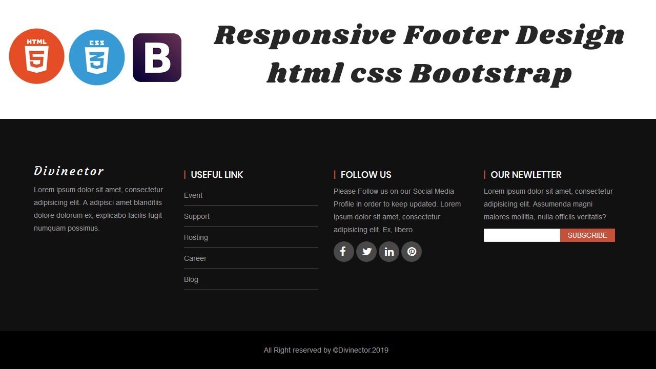
Responsive footer code : Footer is the bottom side best section or body of the document. Adding a Responsive Footer to your Website In this full source code for mobile age, a responsive footer is absolutely essential step by step Example for Responsive Footer HTML CSS.
Responsive Footer Code | Free Source Code
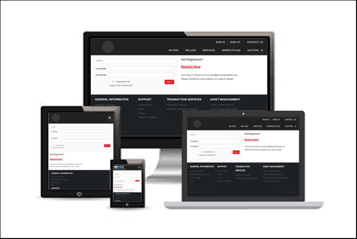
Website footer helps the visitors by adding information and navigation option at the bottom of web pages.
Importance of Footer:
A footer element typically contains:
- Copyright
- Privacy Policy
- Navigation
- Social Icons
- Email Signup
- Your Mission
- Your Values
- Contact
- Address
- Phone
- Fax numbers
Don’t Miss : Responsive Drop Down Menu With Submenu
HTML Code
step 1: first of all you can Copy and paste the following HTML.
CSS CODE:
step 2: Add the custom CSS code below to the main stylesheet of your webpage.
@import url('https://fonts.googleapis.com/css2?family=Poppins:wght@200;300;400;500;600;700&display=swap');
*{
  margin: 0;
  padding: 0;
  box-sizing: border-box;
  font-family: 'Poppins',sans-serif;
  text-decoration: none;
}
footer{
  width: 100%;
  position: fixed;
  bottom: 0;
  left: 0;
  background: #111;
}
footer .article{
  max-width: 1350px;
  margin: auto;
  padding: 20px;
  display: flex;
  flex-wrap: wrap;
  justify-content: space-between;
}
footer .article p,a{
  color: #fff;
}
footer .article .box{
  width: 33%;
  transition: all 0.4s ease;
}
footer .article .topic{
  font-size: 22px;
  font-weight: 600;
  color: #fff;
  margin-bottom: 16px;

}
footer .article p{
  text-align: justify;
}
footer .article .lower .topic{
  margin: 24px 0 5px 0;
}
footer .article .lower i{
  padding-right: 16px;
}
footer .article .middle{
  padding-left: 80px;
}
footer .article .middle a{
  line-height: 32px;
}
footer .article .right input[type="text"]{
  height: 45px;
  width: 100%;
  outline: none;
  color: #d9d9d9;
  background: #000;
  border-radius: 5px;
  padding-left: 10px;
  font-size: 17px;
  border: 2px solid #222222;
}
footer .article .right input[type="submit"]{
  height: 42px;
  width: 100%;
  font-size: 18px;
  color: #d9d9d9;
  background: #eb2f06;
  outline: none;
  border-radius: 5px;
  letter-spacing: 1px;
  cursor: pointer;
  margin-top: 12px;
  border: 2px solid #eb2f06;
  transition: all 0.3s ease-in-out;
}
.article .right input[type="submit"]:hover{
  background: none;
  color:  #eb2f06;
}
footer .article .media-icons a{
  font-size: 16px;
  height: 45px;
  width: 45px;
  display: inline-block;
  text-align: center;
  line-height: 43px;
  border-radius: 5px;
  border: 2px solid #222222;
  margin: 30px 5px 0 0;
  transition: all 0.3s ease;
}
.article .media-icons a:hover{
  border-color: #eb2f06;
}
footer .bottom{
  width: 100%;
  text-align: right;
  color: #d9d9d9;
  padding: 0 40px 5px 0;
}
footer .bottom a{
  color: #eb2f06;
}
footer a{
  transition: all 0.3s ease;
}
footer a:hover{
  color: #eb2f06;
}
@media (max-width:1100px) {
  footer .article .middle{
    padding-left: 50px;
  }
}
@media (max-width:950px){
  footer .article .box{
    width: 50%;
  }
  .article .right{
    margin-top: 40px;
  }
}
@media (max-width:560px){
  footer{
    position: relative;
  }
  footer .article .box{
    width: 100%;
    margin-top: 30px;
  }
  footer .article .middle{
    padding-left: 0;
  }
}
Note : Responsive Navigation Bar & Dropdown with Flexbox (updated, no jQuery)
Example 2 : Simple Responsive Footer Design using HTML and CSS
Sure! Here’s an example of a simple responsive footer design using HTML and CSS:
CSS Code:
footer {
  background-color: #222;
  color: #fff;
  padding: 40px 0;
}

.container {
  max-width: 1140px;
  margin: 0 auto;
}

h4 {
  font-size: 20px;
  margin-bottom: 20px;
}

.social li {
  display: inline-block;
  margin-right: 10px;
}

.social i {
  font-size: 24px;
  color: #fff;
}

@media only screen and (max-width: 767px) {
  footer {
    text-align: center;
  }
  .col-md-4 {
    margin-bottom: 30px;
  }
}
This example footer includes three columns with information about the company, contact details, and social media links. The footer is designed to be responsive, with the columns stacking vertically on smaller screens. The CSS includes a media query to adjust the layout for screens with a maximum width of 767px. You can customize the design further by adjusting the colors, fonts, and layout to fit your website’s branding and style.
Don’t Miss : jQuery mobile hamburger menu
I hope you get an idea about responsive drop down menu with submenu.
I would like to have feedback on my infinityknow.com blog.
Your valuable feedback, question, or comments about this article are always welcome.
If you enjoyed and liked this post, don’t forget to share.