Today, We want to share with you jQuery Full screen Navigation Overlay.In this post we will show you jQuery fullscreen navigation Plugins, hear for fullscreen overlay menu bootstrap 4 we will give you demo and example for implement.In this post, we will learn about Create a Full-Screen Navigation Menu in CSS3 & jQuery with an example.
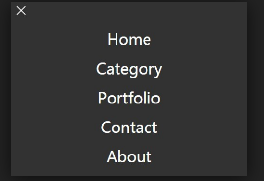
jQuery Full screen Navigation Overlay
There are the Following The simple About jQuery Full screen Navigation Overlay Full Information With Example and source code.
As I will cover this Post with live Working example to develop Full Screen Navigation Overlay, so the Responsive Navigation Bar Menu Tutorials for this example is following below.
Fullscreen Overlay Styles & Effects
HTML Part
pakainfo is the most popular Programming & Web Development blog.
Our mission is to provide the best online resources on programming and web development.
jquery Part
(function($) {
  $(function() {
    $('.dynamic-layer-toggle').click(function() {
      $('aside').toggleClass('open');
    });
  });
})(jQuery);
CSS Part
body {
	background: RGBA(29, 20, 35, 1);
	font-family: 'Muli';
	-webkit-font-smoothing: antialiased;
}
main {
	padding: 60px 15px;
	text-align: center;
	max-width: 100%;
}
h1 {
	font-size: 2.5em;
	font-weight: 300;
	color: rgba(255, 255, 255, .9);
	margin: 0 0 10px;
}
@media screen and (min-width: 600px) {
	h1 {
		font-size: 3em;
	}
}
h2 {
	margin: 0 0 50px;
	font-size: 1.5em;
	font-weight: 200;
	color: rgba(255, 255, 255, .6);
}
aside {
	position: fixed;
	width: 100%;
	height: 100%;
	top: 0;
	left: 0;
	background: linear-gradient(200deg, #27156E, #6A2A88, #9F4981);
	opacity: 0;
	visibility: hidden;
	transition: all .5s ease;
	z-index: 2;
}
.open {
	opacity: 1;
	visibility: visible;
}
nav {
	text-align: center;
	height: 95vh;
	display: flex;
	flex-direction: column;
	justify-content: center;
	ul {
		margin: 0;
		padding: 0;
		list-style: none;
		li {
			align-items: center;
			flex: 1;
			line-height: 20vh;
			a {
        font-size: 1.5em;
				transition: all 0.5s ease;
				display: block;
				text-decoration: none;
				color: rgba(255, 255, 255, .5);
				&:hover {
					color: rgba(255, 255, 255, .9);
					transform: scale(1.1);
					&:before {
						visibility: visible;
						transform: scaleX(1);
					}
				}
				&:before {
					content: "";
					position: absolute;
					width: 50%;
					height: 2px;
					bottom: 0;
					left: 25%;
					background: white;
					visibility: hidden;
					transform: scaleX(0);
					transition: all 0.3s ease-in-out 0s;
				}
			}
		}
	}
}
@media screen and (min-width: 600px) {
  nav ul li a {
    font-size: 3em;
  }
}
button {
	padding: 15px 40px;
	background: transparent;
	border: 1px solid rgba(255, 255, 255, .4);
	color: white;
	border-radius: 8px;
	transition: all .5s ease;
	&:hover {
		border: 1px solid rgba(255, 255, 255, 1);
	}
}
.inactive {
	position: fixed;
	top: 40px;
	right: 60px;
	color: white;
	z-index: 3;
	cursor: pointer;
	font-family: sans-serif;
  span,
  span:before,
  span:after {
    border-radius: 4px;
    height: 5px;
    width: 35px;
    background: white;
    position: absolute;
    display: block;
    content: '';
  }
  span {
    background: transparent;
  }
  span:before {
  transform: rotate(45deg);
  }
  span:after {
  transform: rotate(-45deg);
  }
}
.outer-inactive {
    position: absolute;
    right: 0;
    top: 0;
    width: 85px;
    height: 85px;
    cursor: pointer;
}
Web Programming Tutorials Example with Demo
Read :
Summary
You can also read about AngularJS, ASP.NET, VueJs, PHP.
I hope you get an idea about jQuery Full screen Navigation Overlay.
I would like to have feedback on my infinityknow.com blog.
Your valuable feedback, question, or comments about this article are always welcome.
If you enjoyed and liked this post, don’t forget to share.