Today, We want to share with you Responsive Dropdown Navigation Bar.In this post we will show you Responsive Pure CSS Dropdown Navigation Menu, hear for Simple Responsive Dropdown Navigation With jQuery we will give you demo and example for implement.In this post, we will learn about responsive drop down menu with submenu bootstrap with an example.
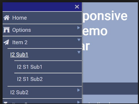
Responsive Dropdown Navigation Bar
There are the Following The simple About Responsive Dropdown Navigation Bar Full Information With Example and source code.
As I will cover this Post with live Working example to develop CSS Responsive Navbar With HTML & JavaScript, so the responsive drop down menu with submenu for this example is following below.
How To Create a Responsive Navbar with Dropdown
HTML Part
Navigation - Pakainfo.com
Responsive Dropdown Navigation Bar.
Responsive Tutorials Step By step Dynamically Add Or Remove DropDownLists using jQuery
jQuery/JavaScript Part
(function($) {
  $(function() {

    $('menu ul li a:not(:only-child)').click(function(e) {
      $(this).siblings('.light-way-menu-drop-down').toggle();

      $('.light-way-menu-drop-down').not($(this).siblings()).hide();
      e.stopPropagation();
    });

    $('html').click(function() {
      $('.light-way-menu-drop-down').hide();
    });

    $('#light-way-menubar').click(function() {
      $('menu ul').slideToggle();
    });

    $('#light-way-menubar').on('click', function() {
      this.classList.toggle('active');
    });
  });
})(jQuery);
CSS Part
$content-width: 1000px;
$breakpoint: 799px;
$menu-height: 70px;
$menu-background: #262626;
$menu-font-color: #ffffff;
$link-hover-color: #2581DC;

.menuigation {
  height: $menu-height;
  background: $menu-background;
}

.brand {
  position: absolute;
  padding-left: 20px;
  float: left;
  line-height: $menu-height;
  text-transform: uppercase;
  font-size: 1.4em;
  a,
  a:visited {
    color: $menu-font-color;
    text-decoration: none;
  }
}

.menu-container {
  max-width: $content-width;
  margin: 0 auto;
}


menu {
  float: right;
  ul {
    list-style: none;
    margin: 0;
    padding: 0;
    li {
      float: left;
      position: relative;
      a,
      a:visited {
        display: block;
        padding: 0 20px;
        line-height: $menu-height;
        background: $menu-background;
        color: $menu-font-color;
        text-decoration: none;
        &:hover {
          background: $link-hover-color;
          color: $menu-font-color;
        }
        &:not(:only-child):after {
          padding-left: 4px;
          content: ' ▾';
        }
      }
      ul li {
        min-width: 190px;
        a {
          padding: 15px;
          line-height: 20px;
        }
      }
    }
  }
}

.light-way-menu-drop-down {
  position: absolute;
  display: none;
  z-index: 1;
  box-shadow: 0 3px 12px rgba(0, 0, 0, 0.15);
}

.menu-mobile {
  display: none;
  position: absolute;
  top: 0;
  right: 0;
  background: $menu-background;
  height: $menu-height;
  width: $menu-height;
}
@media only screen and (max-width: 798px) {
  .menu-mobile {
    display: block;
  }
  menu {
   width: 100%;
    padding: $menu-height 0 15px;
    ul {
      display: none;
      li {
        float: none;
        a {
          padding: 15px;
          line-height: 20px;
        }
        ul li a {
          padding-left: 30px;
        }
      }
    }
  }
  .light-way-menu-drop-down {
    position: static;
  }
}
@media screen and (min-width: $breakpoint) {
  .menu-list {
    display: block !important;
  }
}
#light-way-menubar {
  position: absolute;
  left: 18px;
  top: 22px;
  cursor: pointer;
  padding: 10px 35px 16px 0px;
  span,
  span:before,
  span:after {
    cursor: pointer;
    border-radius: 1px;
    height: 5px;
    width: 35px;
    background: $menu-font-color;
    position: absolute;
    display: block;
    content: '';
    transition: all 300ms ease-in-out;
  }
  span:before {
    top: -10px;
  }
  span:after {
    bottom: -10px;
  }
  &.active span {
    background-color: transparent;
    &:before,
    &:after {
      top: 0;
    }
    &:before {
      transform: rotate(45deg);
    }
    &:after {
      transform: rotate(-45deg);
    }
  }
}

article {
  max-width: $content-width;
  margin: 0 auto;
  padding: 10px;
}
Web Programming Tutorials Example with Demo
Read :
Summary
You can also read about AngularJS, ASP.NET, VueJs, PHP.
I hope you get an idea about Responsive Dropdown Navigation Bar.
I would like to have feedback on my infinityknow.com blog.
Your valuable feedback, question, or comments about this article are always welcome.
If you enjoyed and liked this post, don’t forget to share.