Today, We want to share with you Create Different CSS Geometric Shapes with Example.
In this post we will show you CSS Shapes for Geometric with Example, hear for How To Create Different Shapes with CSS we will give you demo and example for implement.
In this post, we will learn about How to Quickly Create Shapes in Pure CSS with an example.
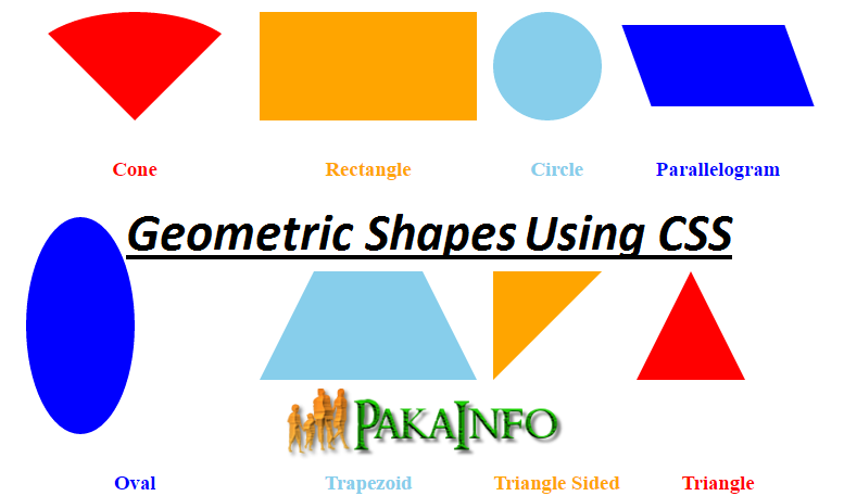
Create Different CSS Geometric Shapes
There Following some Create Different CSS Geometric Shapes with Example Custome CSS styles will come simple basically handy when We want to more button, any shapes draw geometric more good perfect shapes with these all the customes CSS without using any types of the images. Most of them are done using latest version of the CSS3 as well as There check if We your browser all the Geometric Shapes supports it.
Circle
HTML & CSS for Circle
.circle {
   width: 100px;
   height: 100px;
   background: #9400D3;
   -moz-border-radius: 50px;
   -webkit-border-radius: 50px;
   border-radius: 50px;
}
Circle – Output
Oval
HTML & CSS for Oval
.oval {
	height: 200px;
	width: 100px;
	background: #9400D3;
	-moz-border-radius: 50%;
	-webkit-border-radius: 50%;
	border-radius: 50%;
}
Oval – Output
Triangle
HTML & CSS for Triangle
.triangle {
	height: 0;
	width: 0;
	border-left: 50px solid transparent;
	border-right: 50px solid transparent;
	border-bottom: 100px solid #9400D3;
}
Triangle – Output
Triangle Sided
HTML & CSS for Triangle Sided
.triangle-sided {
	height: 0;
	width: 0;
	border-top: 100px solid #9400D3;
	border-right: 100px solid transparent;
}
Triangle Sided – Output
Rectangle
HTML & CSS for Rectangle
.rectangle {
   height: 100px;
   width: 200px;
   background: #9400D3;
}
Rectangle – Output
Parallelogram
HTML & CSS for Parallelogram
.parallelogram {
   height: 75px;
   width: 150px;
   background: #9400D3;
   -webkit-transform: skew(20deg);
   -moz-transform: skew(20deg);
   -o-transform: skew(20deg);
   transform: skew(20deg);
}
Parallelogram – Output
Trapezoid
HTML & CSS for Trapezoid
.trapezoid {
	height: 0;
	width: 100px;
	border-bottom: 100px solid #9400D3;
	border-left: 50px solid transparent;
	border-right: 50px solid transparent;
}
Trapezoid – Output
Cone
HTML & CSS for Cone
.cone {
  height: 0;
  width: 0;
  border-left: 100px solid transparent;
  border-right: 100px solid transparent;
  border-top: 100px solid #9400D3;
  -moz-border-radius: 50%;
  -webkit-border-radius: 50%;
  border-radius: 50%;
}
Cone – Output
Angular 6 CRUD Operations Application Tutorials
Read :
Summary
You can also read about AngularJS, ASP.NET, VueJs, PHP.
I hope you get an idea about 8 Examples of Unorthodox Shapes Created with CSS .
I would like to have feedback on my Pakainfo.com blog.
Your valuable feedback, question, or comments about this article are always welcome.
If you enjoyed and liked this post, don’t forget to share.